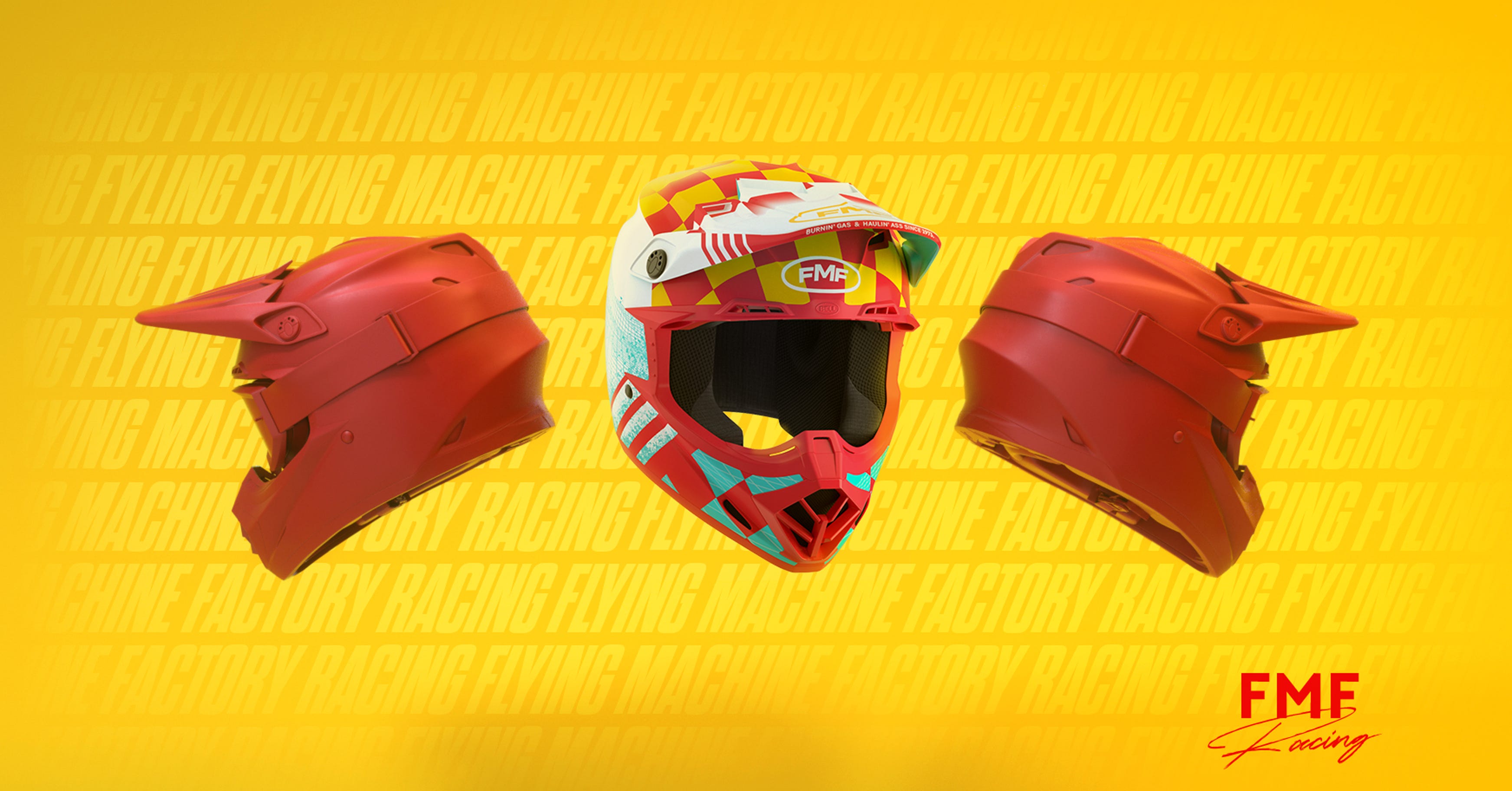
Gear Shift: A Brand Designer’s Journey for Good Motocross Gear
Why, oh why, did I decide to redesign motocross helmets?
I bet you’re probably wondering that.
..
No?
Well you’re here. So I’ll tell you why.
Maybe it was the thrill of the riding, or perhaps the excitement of wearing a quirky product. I mean, let’s be honest, at the time of making this product, I had been off-roading for less than a year.
But I wanted a shiny helmet.
And if you want something that doesn’t exist yet, why not make it?
So I decided to research, mock, and produce a product and the entire accompanying campaign production (editorial and all), because why not? I already conquered off-roading, what’s another wildly lengthy and strenuous challenge added into the mix?
In all seriousness, the thought of researching and then producing a viable product in an industry I loved deeply was an incredibly tantalizing thought— so away I went..
This story begins in a motorcycle store, where I find myself on a quest for the perfect helmet to wear on my next off-roading excursion. It had been a bit since I took on a recent creative project, and while I was just starting to regain traction in my design career, I just couldn’t get a new hobby I had picked up out of my mind:

Standing before an array of helmets, I was struck by the uninspired color palettes — endless variations of grey, black, white, and brown, with only a few splashes of red and blue. In this world of adventure and exhilaration, all I felt was conformity and motonony. Unbeknownst to me, this moment of frustration would soon spark a wave of creativity and lead to the birth of an entirely new campaign and product idea..

Three weeks from that moment, the concept swirling in my mind would finally grace my canvas.
Recently, I’d ventured into the realm of Cinema 4D — a 3D modeling software that promised to elevate my design capabilities. Despite the daunting learning curve, the thrill of transforming my designs from flat, boring sketches into dynamic, three-dimensional models was profoundly satisfying (to say the least). Mastery of this tool wasn’t just a goal — it was a necessity.
First Few Weeks: Discover, research, iterate
So there I was, inspired, by my MacBook, brainstorming a helmet redesign for young, vibrant 20-somethings with a heart for adventure and a mind of design. I could see it now: These helmets featured on billboards, in editorials, and in digital campaigns alike.
It was thrilling.
Yet, one question remained..
Could I design a motorcycle helmet that I riders would actually want to wear?

It was the first true hurdle in my quest for success.
Yes, while it might have seemed obvious at the time, it was important to remember these massive multi-million dollar companies were producing monotonous products for a reason..
These thoughts not only challenged my design acumen, but also compelled me into the diligent phase of market and consumer research, where understanding the product and its audience became paramount. It wasn’t just going to be a great product campaign in the industry, it was going to be the greatest product campaign ever created. I would set the bar high, or die trying.
UNDERSTAND THE PRODUCT
The journey began with a deep dive into the current landscape of sleek, trendy helmet designs. In the world of motocross, giants like Fox and Bell stood out for their impeccable designs and attention to detail, setting a high bar for my project. Their clean, innovative styles weren’t just products; they were statements. Yet, while incredibly sleek and forward in their design, their styles remained very subtle, and far and few inbetween when it came to out-of-the-box designs. Quite literally, the product inventory of well-designed helmets were literally 4–5 styles, max. I mean, these were the best of the best. Of all the brands, of all the products out there, I could identify a handful of unique styles, and that was it.

In the world of motocross, giants like Fox and Bell stood out for their impeccable designs and attention to detail..
This exploration was not merely about identifying trends but also about recognizing opportunities where I could bridge the gap between functionality and flair.
—
Grasping the Culture
As I delved deeper into my research, I realized I needed a brand that not only excelled in the industry but also had a rich history and a strong heritage to it’s location. While looking into this, I became drawn to the vivid and adventurous spirit of the ’80s motocross era — its bold colors and dynamic designs encapsulated the essence I wanted to capture. All in a place I was all to familar with; Southern California.
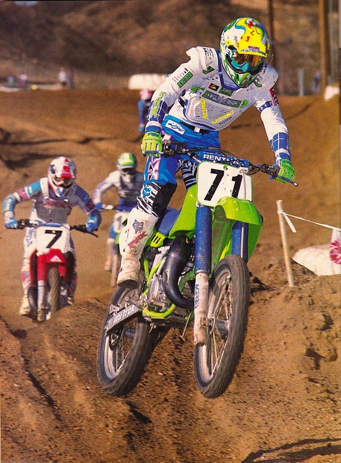
In my research, I discovered FMF, a brand that epitomized motocross passion and heritage. Founded in 1973 in Southern California, FMF wasn’t just a manufacturer; it was a motocross institution known for performance and innovation. And they had just unveiled a new lineup of motorcycle products titled: POWER CORE — Coincidentally the perfect name for this new helmet design.
Who knew?
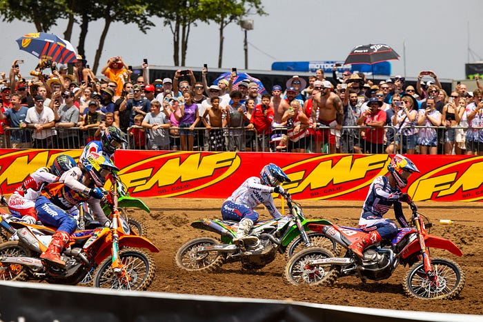
Celebrated for its high-performance motorcycle parts and deep roots in the motocross community, FMF ticked all the boxes: an amazing legacy, strong product positioning, a direct connection to SoCal, and the potential to be excellent inspiration for design work.
Understanding the Process
Choosing FMF as my inspiration marked the beginning of an exhilarating phase: giving their classic logo a modern update to connect with a younger audience. This task of refreshing FMF’s visual identity was not just about aesthetic enhancement but also about aligning the new brand with contemporary sensibilities.
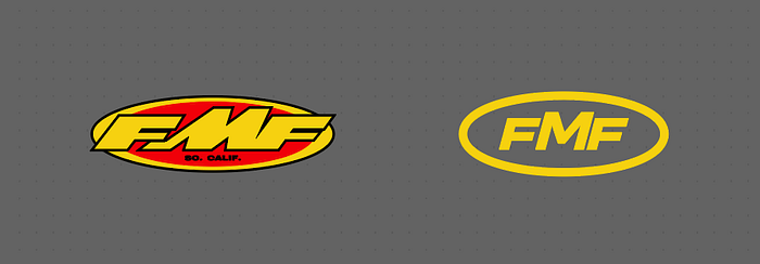
The redesign focused on subtle yet impactful changes: maintaining the prominence of the ‘M’ cap height, tightening the letter-spacing for a more cohesive look, dropping the ‘So Cal’ descriptor for a streamlined aesthetic, and refining the oblong-encased oval mark to modernize the logo without losing its iconic motif.
The hard work: Designing within constraints
The initial phase of design was crucial for establishing creative boundaries that would drive the project. To streamline my efforts and ensure the final product was both aesthetically pleasing and functional, I set three specific constraints that would guide the entire design process. Afterall, I was undertaking this project as a designer of one; so there had to be obvious constraints. These constraints were essential in shaping the scope and direction of the project:
- Model Availability: I chose a helmet style for which a 3D model was readily available, ensuring fast practicality in design execution. No way could I feasibly design this helmet from scratch in the 1-month time frame I was considering.
- Thematic Adherence: Each design iteration was required to strictly embody the vibrant and bold aesthetics of the ’80s, reflecting the era’s distinctive style and the heritage of the FMF brand.
- Color Scheme: The designs had to incorporate FMF’s signature bright colors, maintaining brand identity while appealing to modern tastes. The market I had identified would appeal very strongly to FMF given the market-awareness that was already baked into the brand.

My final design satisfied all three constraints: it used a Bell Moto-9 model found commonly online, featured a prominent 80s aesthetic complete with checkered patterns for racing inspiration, and used FMF’s bright yellow and deep red colors highlighting the core-visuals of the brand. Then I threw a splash of cyan to complete the flair.
At the end of the first weeks: Design, design, design!
Having settled on a design that met my constraints, I quickly moved on to 3D modeling and product mocking. This process could get very messy very quickly, but it needed to move fast, so I defined a system of challenges I needed to tackle as the solo designer, director, and manager:
- Defining success and project scope.
- Streamline efficiencies in workflow and cut out potential hang-ups.
- Define the design process and activities.

1. Defining Success and Scope
Since this was speculative work with no real stakeholders, it was crucial to define success in a way that would translate to the success of this campaign. The work had to be developed iteratively, involving feedback from people within the target demographic (my riding buddies). Then, the scope of work needed to be clear and straightforward. This included defining deliverables such as designing editorial content, billboard mocks, and product mocks for use across mobile, web, and physical.
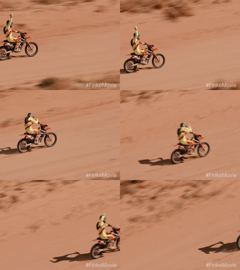
2. Streamlining the Design Workflow
The second most important part of this system was defining the workflow and process of production. So I started by defining where printed materials would live first (magazine, poster, billboard design), as these could take in a real campaign much longer to produce. This began with defining printed collateral to be produced, then digital assets such as product mocks to be created, and finally digital content for marketing and handoff.

3. Define the design process
Defining this process needed to be streamlined and efficient. With the scope of deliverables defined, collateral would start accumulating quickly. I needed to define not just the types of posters produced but also the spec sizes for the posters and billboard mocks to be made, as this would influence technical files associated with product mocks in rendered in Cinema 4D. If I was going to spend 1–2 days rendering concepts in realtime, they had to be items that would have to come either at the beginning or the end, otherwise this whole process could slow to a crawl. So I decided to structure the campaign around four main activities:

These four activities — user research, product design, copywriting, and creative direction — were crucial to supporting the overall brand design & outlook. User research ensured the designs resonated with the target audience (which I was already doing). Product design integrated practical and aesthetic elements (which made good products). Copywriting crafted compelling narratives and brand messages (which highly complemented brand interaction). Creative direction ensured all elements aligned with the campaign’s vision and goals (bringing everything together).
The Result: More Than Just Aesthetics
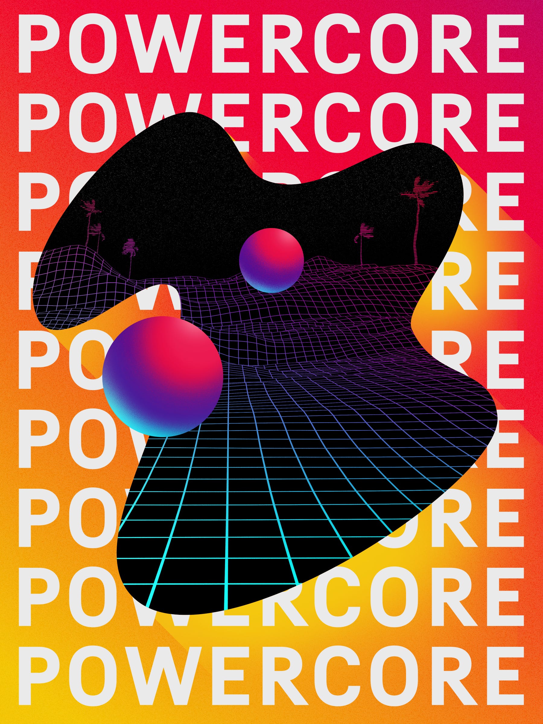
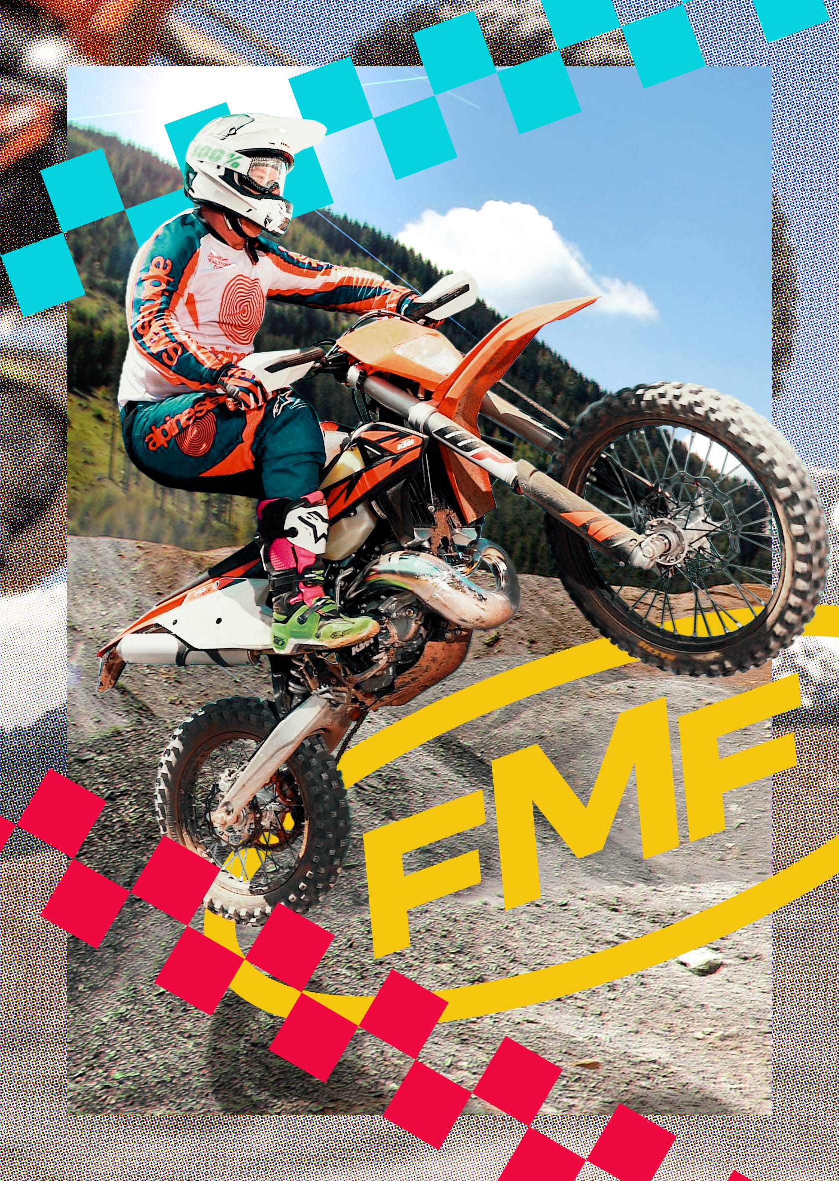
After weeks of relentless design and refinement, the project culminated in a series of outputs: a UV-mapped 3D model of the helmet, a completely designed magazine and full editorial spread, social media content, and so much more. Each piece not only aligned with the vibrant FMF brand but also aligned with the adventurous spirit of motocross itself:
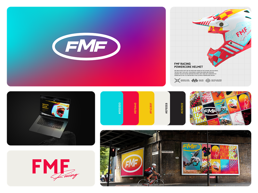

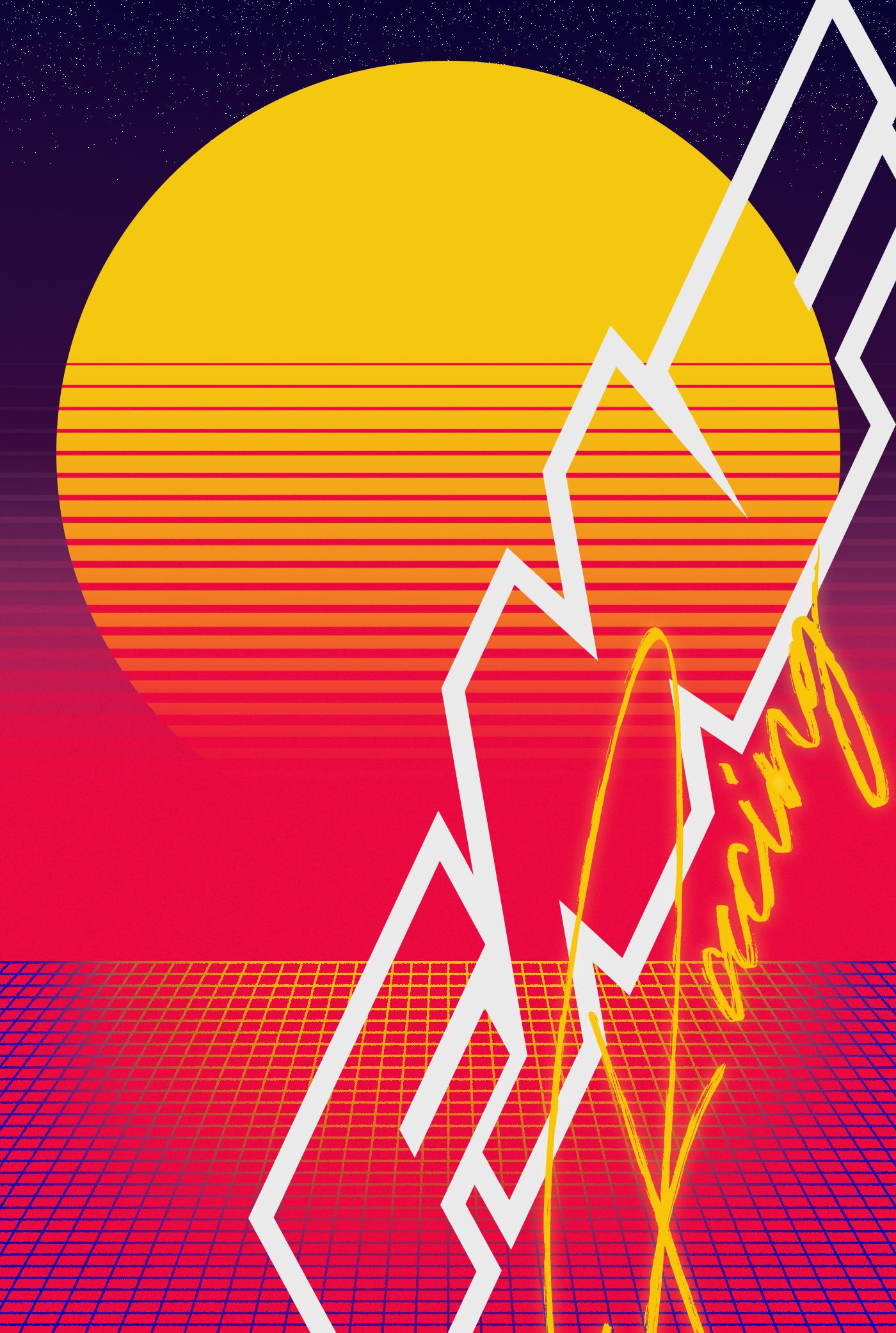

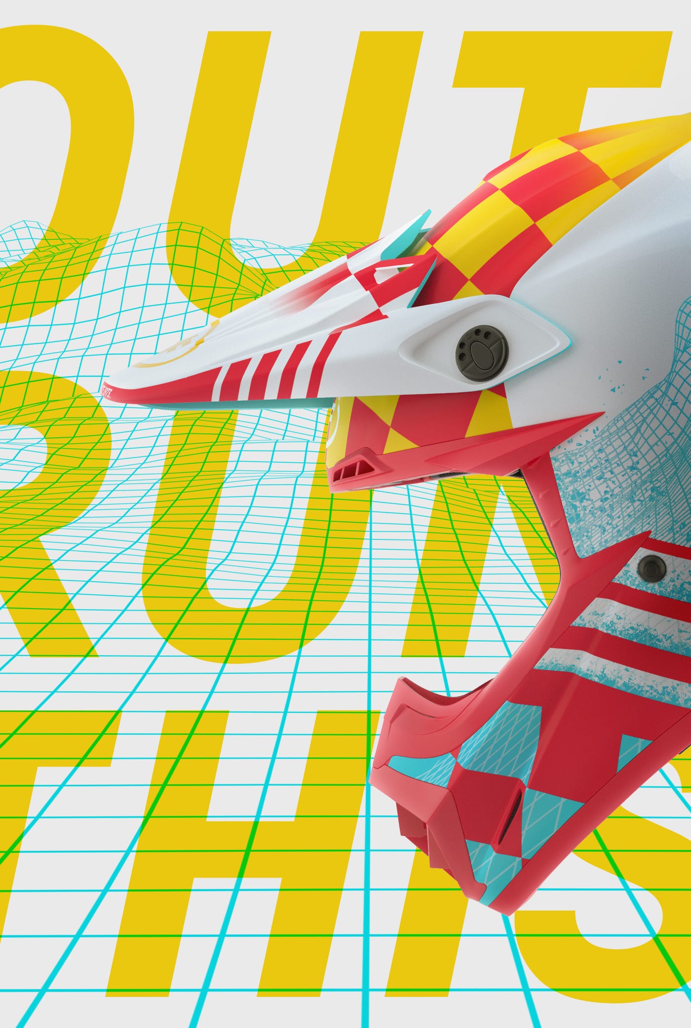
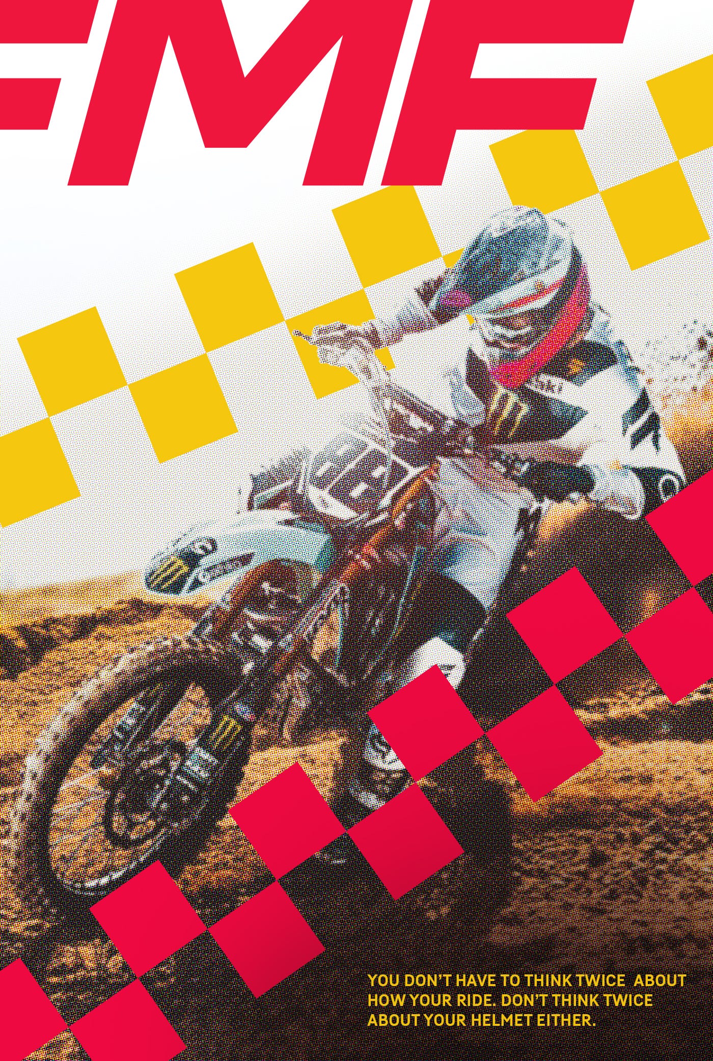
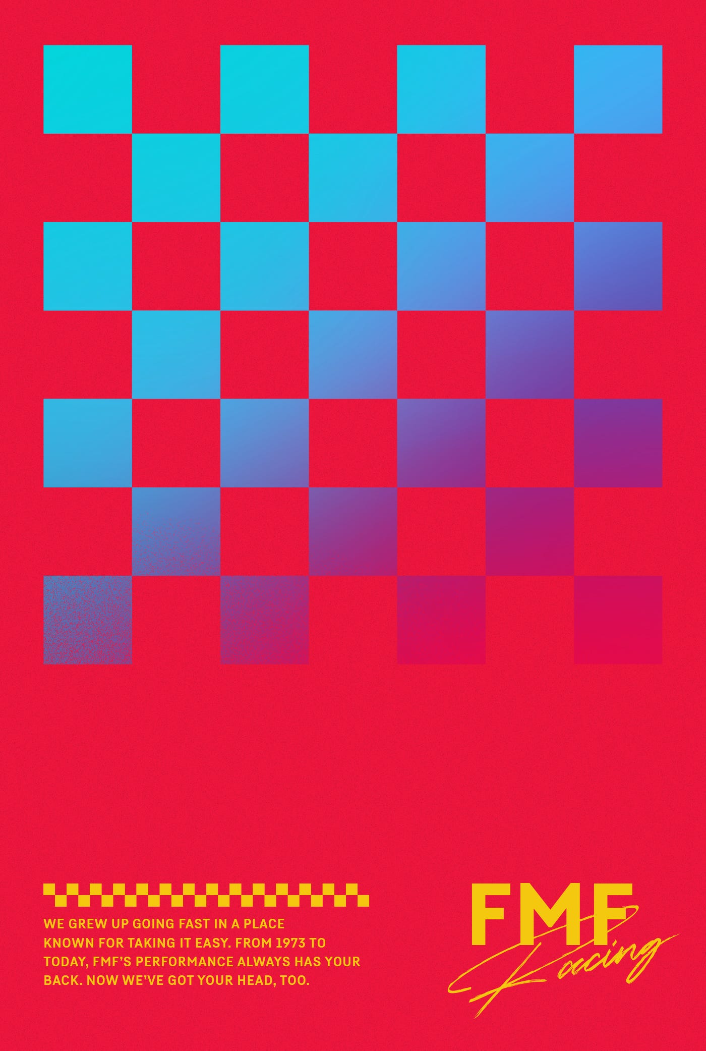


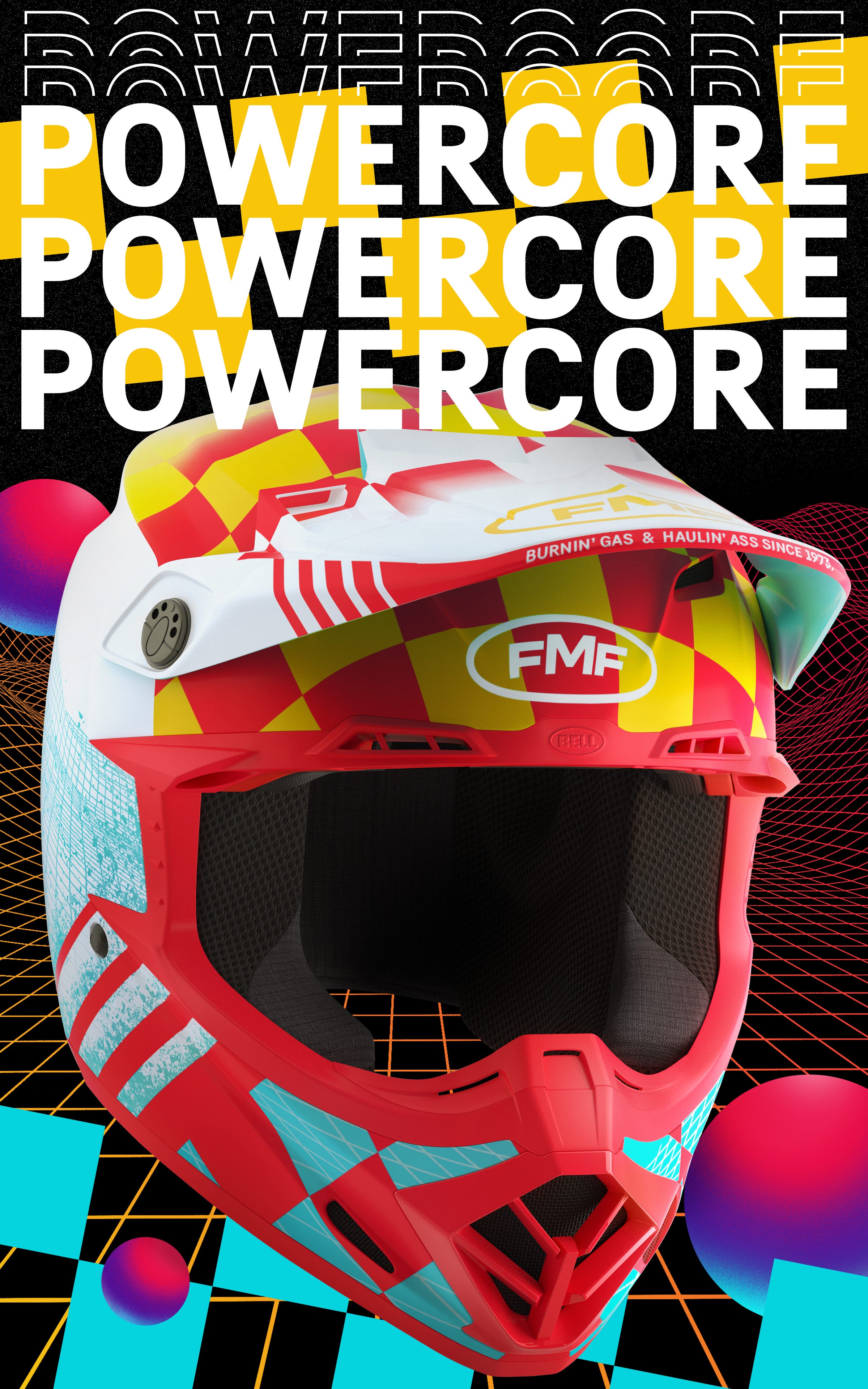
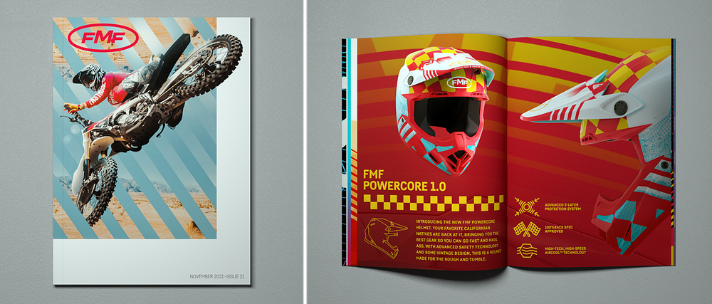
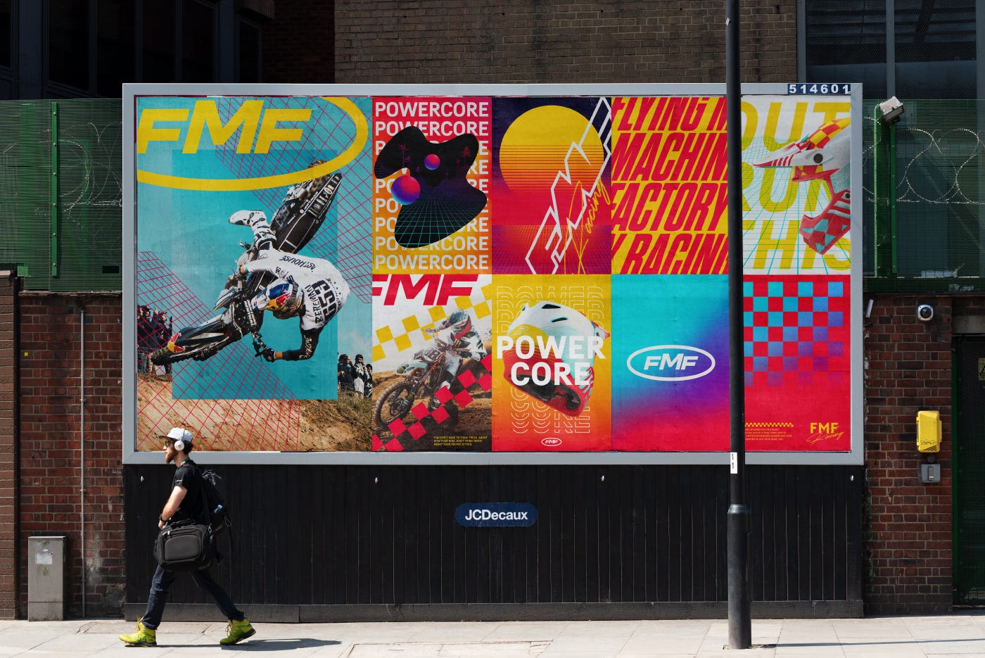
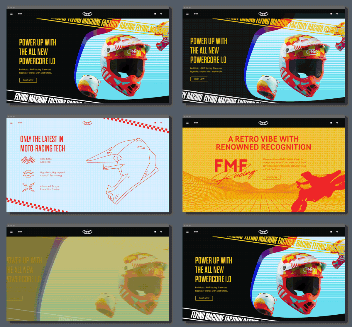
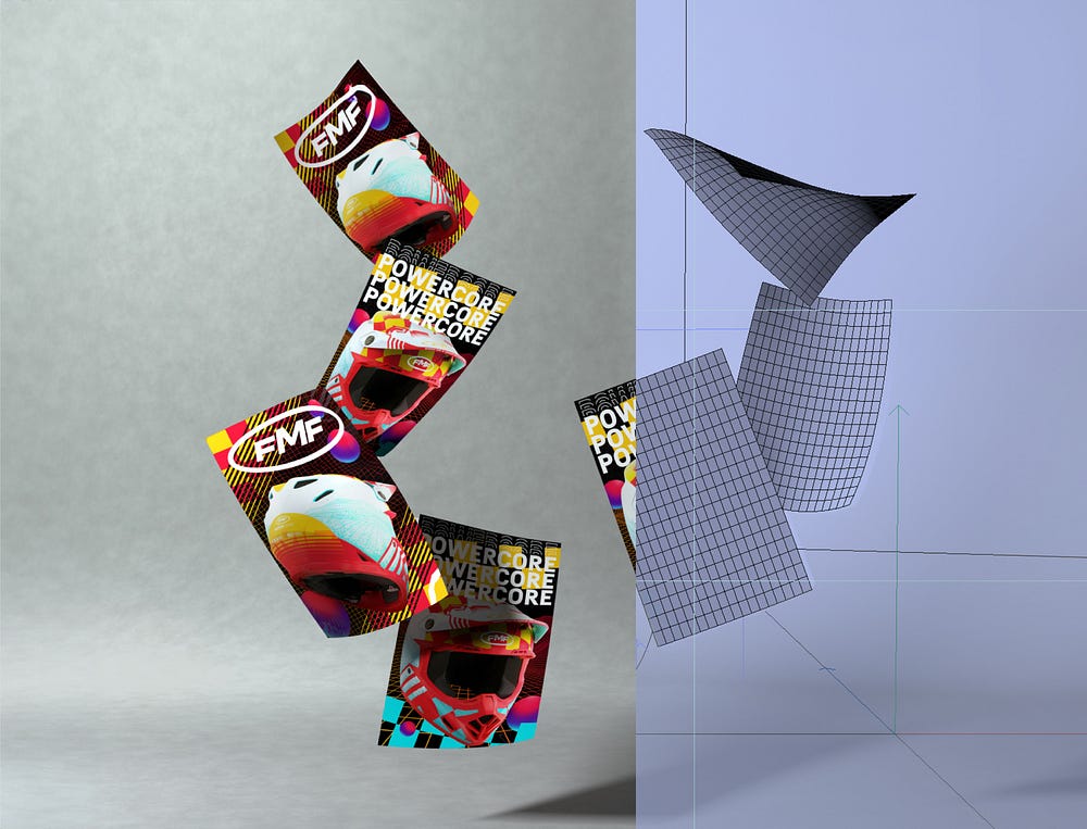
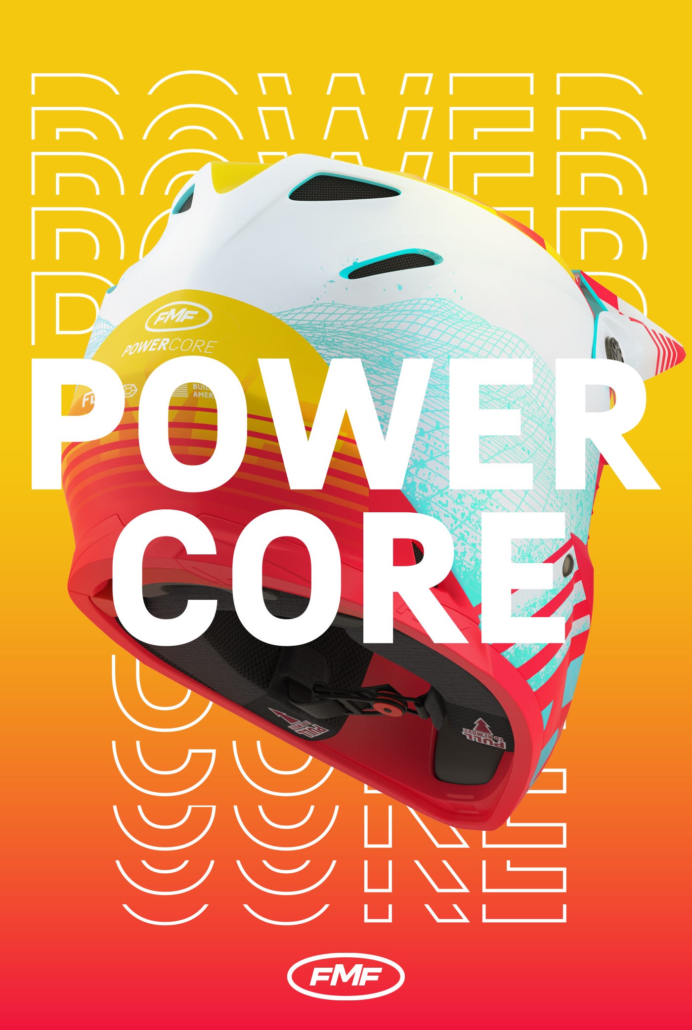
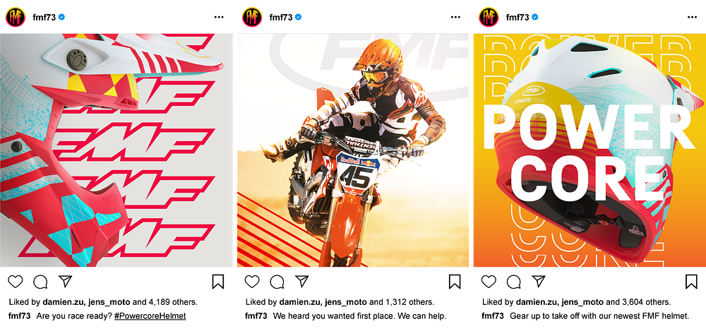
In the end, the project was a hit amongst my network and motocross enthusiasts alike, garnering acclaim for its creative vision and execution. Of the people I talked to, they raved about the designs, the posters, and the campaign work that was done. So much so that it even received a shoutout from the son of none other than FMF’s founder, Donny Emler Jr himself!

In the end, here’s what I learned:
- Combining a deep understanding of a brand’s history with forward-looking design can revitalize its image and market presence.
- Integrating user feedback is instrumental in refining designs to better meet the needs and preferences of the target audience.
- A structured approach to design and production can streamline processes and ensure high-quality outcomes.
This project was not only a testament to my design skills; it was also a profound reminder of the transformative power of simple visual storytelling. Each helmet, each design iteration reaffirmed my dedication to blending bold aesthetics with functional innovation.
And, it was a pretty cool helmet.

Read More by Damien ↓
